


- neighborhood
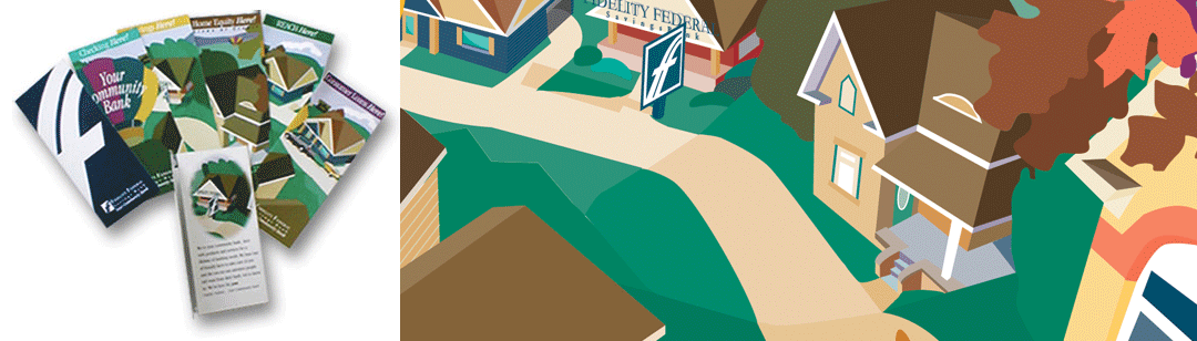
The neighborhood bank branding illustration
- storybook
- brochuresystem
THE CLIENT PROJECT: Fidelity Federal is one of Cincinnati's small investment and financial institution based in the suburb of Norwood, Ohio. It was founded over 100 years ago. Unlike many larger commercial banks in the Cincinnati market, as a community bank, it knew its clients on a first name basis. Although they had remained rock solid, their customer base changed drastically. People wanted services they thought only a national bank could provide. Although going this route cost the customer human face interaction. Fidelity Federal approached CreechCreative with the request to rebrand them but maintained the essence of their identity as being the local bank with branches right across the street. |
|---|
THE PROCESS The redesign began with an audit of collateral materials produced formerly by the institution. CreechCreative evaluated the diverse selling processes of each piece then devised a strategy to eliminate redundancies and extraneous marketing materials. With the audit complete, the re-branding could begin. The corporate logo was retained, although modified slightly. The next step was to produce a portfolio of templates for each of the collateral and marketing materials to be used by the bank team, which enable them to customize materials for each customers. |
|---|
THE FINAL SOLUTION The Fidelity Federal marketing team has used the new system and found it very flexible and user-friendly. One of the success stories is how the storybook branding of the bank has enhanced its image within the neighborhood and has attracted attention by larger banks that are considering buying the smaller competitor. Other case studies: |
|---|