


- HRold
Original identity established in the early 1950's for the founders Hendon/Lurie and Associates.
- HRConcept1
The following slides are a series of initial design concepts for the identity for the corporation.
- HRConcept2
This design illustrates a concept in the series of initial design concepts for the identity for the corporation.
- HRConcept3
This design illustrates a concept in the series of initial design concepts for the identity for the corporation.
- HRConcept4
This design illustrates a concept in the series of initial design concepts for the identity for the corporation.
- HRConcept5
This design illustrates a concept in the series of initial design concepts for the identity for the corporation.
- HRnew
Thinking outside the box became the corporations mantra. The design displays the vision, function, space, culture, ideas and experience of thinking outside the box.
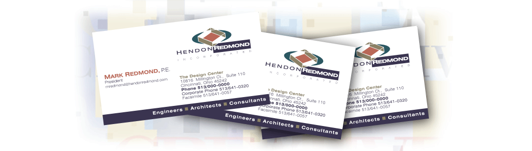
- HRBC
Application of the design on business cards.
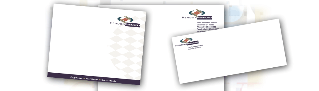
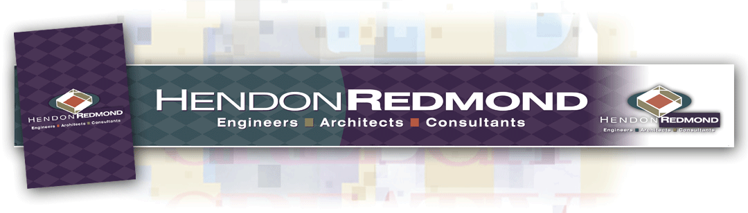
- HRstationary
Coordinating letterhead, note cards and envelopes for the complete stationary package.¯
- HRAd
Application of the design on print advertising.
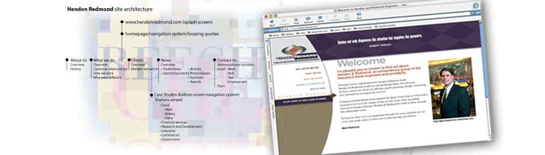
- HRWeb
Application of the design on teh internet.
- HRtradeshowgraphics
These images are of environmental tradeshow graphics for booth headers and countertop.
THE CLIENT PROJECT: CreechCreative’s work with Hendon and Redmond (H/R) is a great example of the partnership approach to design. H/R's overview brochure and website explain their philosophy, "We think outside the box." Identities are a constant conversation between people, environment and culture. Hendon and Redmond, founded over fifty years ago, were in the midst of internal change and needed a new dynamic image to express the new team. Our assignment required that we develop a fresh visual/verbal language that reflected that change in culture. |
|---|
THE PROCESS Our process starts with our normal analysis of the clien's historyt, audience, issues and points of difference. This includes the information gathering and interviewing process, which leads to a document about the client’s background, personality, services, and connection to their audience. The design team develops approaches and begins thoughts of implementation. These concepts are shared with the client, not for approval, but purely for discussing the merits of each direction. We gather further client input before final development and implementation. “Thinking outside the box” became the corporation’s mantra. The final design must display the vision, function, space, culture, ideas and experience. |
|---|
THE RESULTING LOOK It became obvious in the early stages of analysis that Hendon and Redmond were known for their strong client relationships, quality team, and practicality, and professionalism. It was important for CreechCreative to emphasize H/R’s thinking process, energy, and innovation. The new Hendon and Redmond identity is composed of three parts: logotype, "contextual modifiers" and "identifiers" (describing the services of architects, engineers, and consultants). All three elements establish the brand. Other case studies: |
|---|