


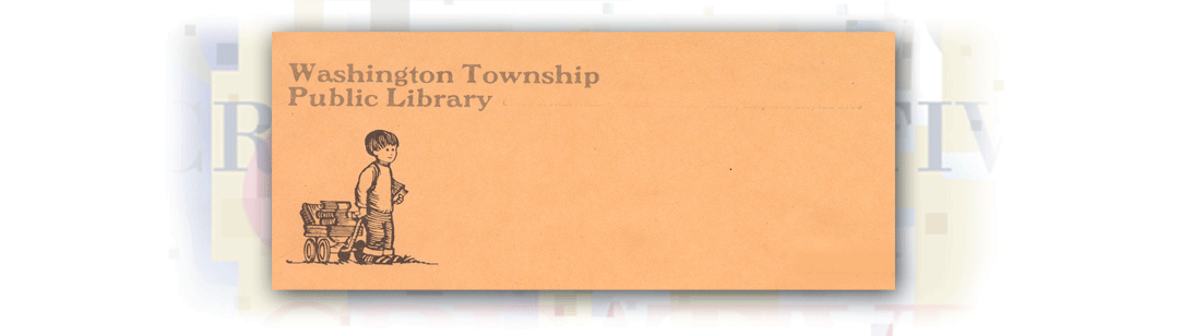
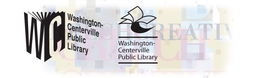
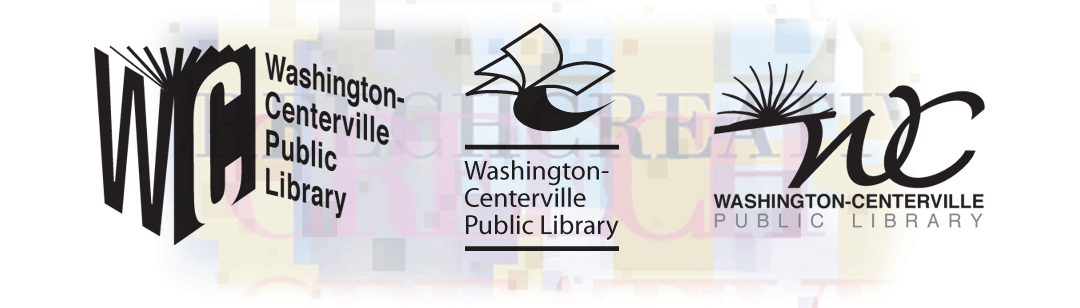
- orginallogo
The above image is the historical original logo developed for the library.
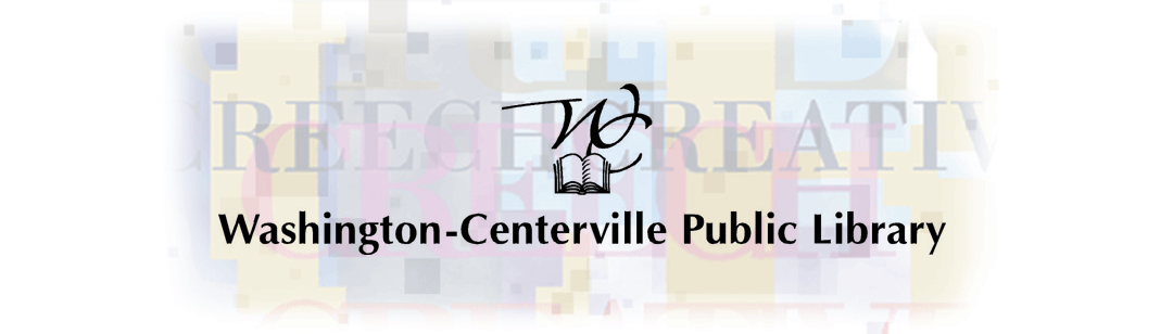
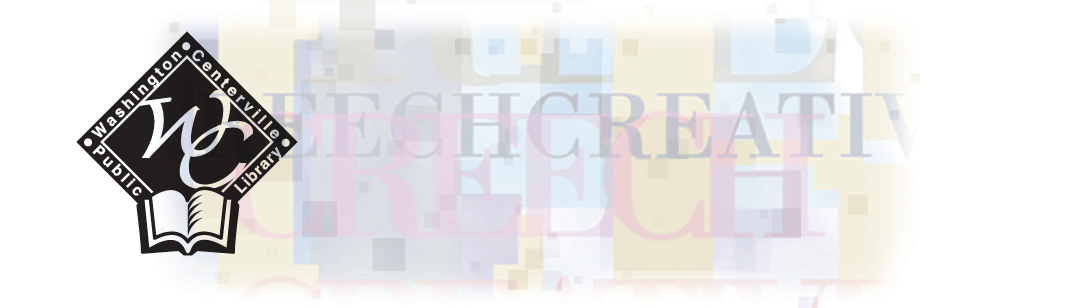
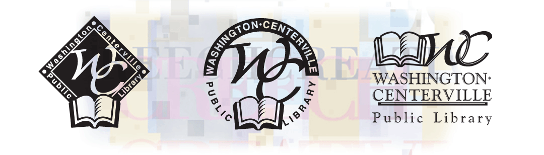
- WCPLlogo
This represents the identity for the merged library systems of Washington Courthouse and Centerville, Ohio.
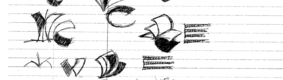
- roughs
This slide demonstrates some of the initial exploration of concepts.
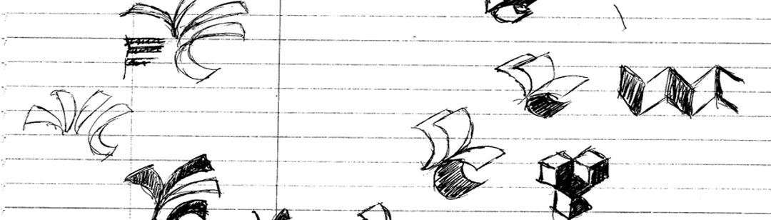
- roughs1
This slide demonstrates some of the initial exploration of concepts.
- roughs2
This slide demonstrates some of the initial exploration of concepts.
- concept
Concepts
- concept1
Concepts
- concept2
Concepts
- concept6
Concepts
- concept7
Concepts
- concept8
Concepts
- concept3
Concepts
- concept4
Concepts
- concept5
Concepts
- finallogo
This image displays the final identity for the WCPL library system.
- BestInNation
This image displays the final identity for the WCPL library system after being named one of the nations best systems.
THE CLIENT PROJECT: The beauty of an identity redesign project is that the client comes to CreechCreative seeking a new vision. This client made a decision to reshape their old identity. This cutting edge library system found itself falling behind the competition and a fresh more practical design approach would speak better to its clients and customers. The Washington-Centerville Public Library (WCPL) asked CreechCreative to reshape their identity and assist in managing the change that occurred with the implementation.
|
|---|
THE PROCESS A quick visual audit of WCPL old materials proved that their identity was scattered in many different directions. After doing the assessment, to rein in all the creative directions and better define Washington-Centerville Public Library's core value and offered suggestions to revising their branding proposition. In the end, everyone agreed that WCPL needed to retain its historical look, including the woodcut illustration of the book, but added a more concise, fresh, organized design approach.
|
|---|
THE RESULTING LOOK As a nonprofit, cost savings are a must so the final logo was produced to work well in black and white and one color, as well as when photocopied. he customers are responsive and compliment the library's staff on the fresh new look and effective use of the new image. Other case studies: |
|---|